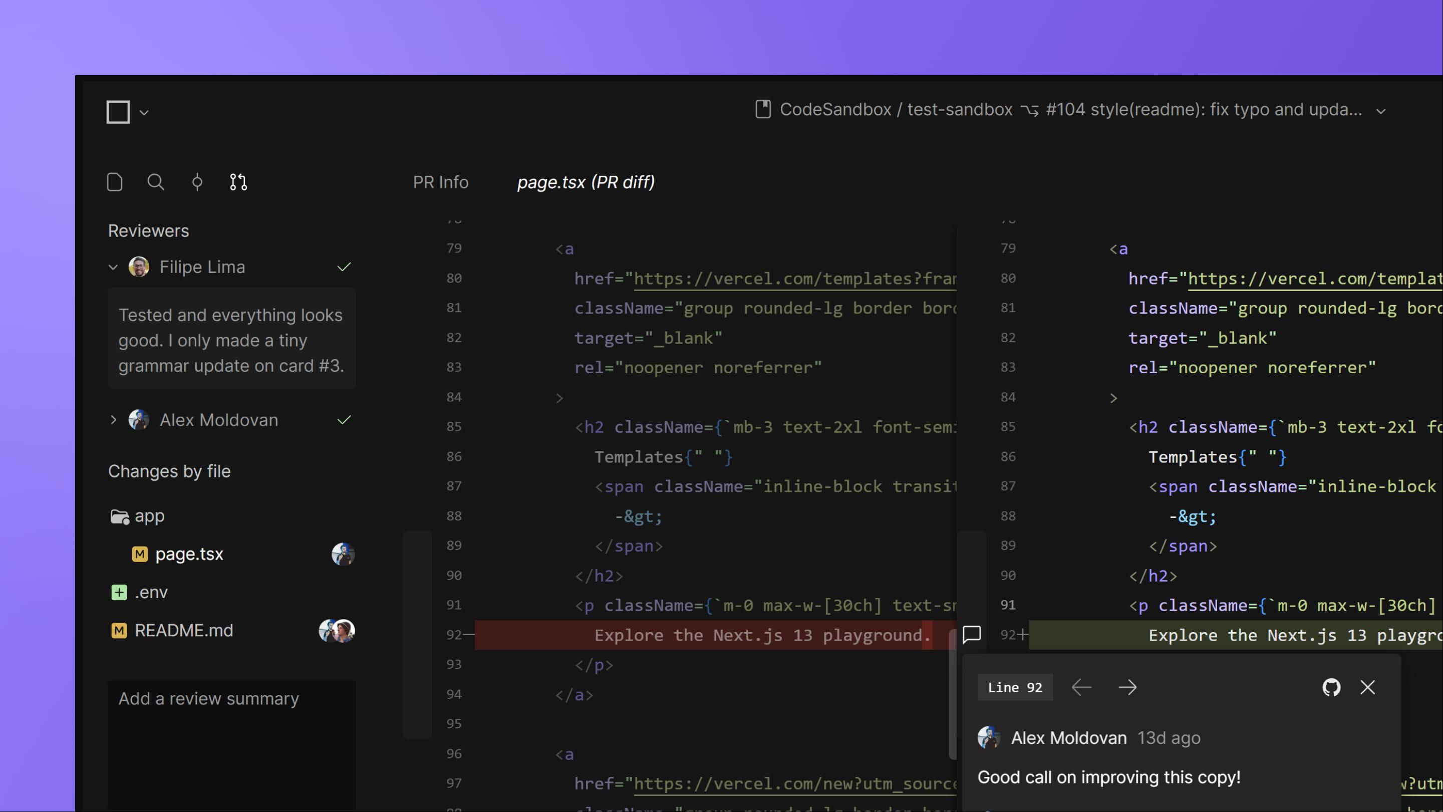
Code reviews, editor updates and custom themes

Hi there! We are very excited to be back with a fresh update (hopefully, fresh enough to help you beat the heat).
We will keep it short and sweet, so let's get going!
What's new?
Full code reviews in CodeSandbox 🔥
After talking with hundreds of developers, we came to realize that the typical code review process is... a mess. So, we are making CodeSandbox the all-in-one tool for code reviews. See our getting started video to try it out.
Update the cloud editor to use VS Code web
We have overhauled our cloud editor to use VS Code web, which brings several new improvements including: more complete language support; support for LSP actions that require multiple files; improved syntax highlighting; git dirty decorations; file navigation history.
Cloud editor layout updates
We have shipped a bunch of quality-of-life features to improve the DX of our cloud editor. These include automatically killing closed tasks and terminals; fixing panels for the editor, shells and DevTools; updating the default layout and introducing an alternative layout; adding UI shortcuts to split and collapse panels.
Custom themes for the cloud editor
This one was on top of our to-do list for a while. Now, you can change the theme in our cloud editor to a brand-new light theme or pick from a selection of other themes, including some GitHub defaults and some other crowd favorites like Poimandres, Vesper, and Dracula.
Improvements & Bug Fixes
Fixed a significant bug in memory ballooning and snapshotting.
Improved the security of the preview DevTool.
Several improvements and fixes to the handling of review comments.
Simplified the logic for showing reviewers and added feedback on submitting a review.
Improved the UX for users with no access to a workspace.
Fixed a bug that broke the behavior of the component inspector tool.
That's all for now!
Feel free to reach out if you have any questions or feedback. We're on Discord!
See you on the next one 👋