Introducing Teams
A new dashboard that's built for collaboration.

While we often write code alone, creating products typically takes a whole group of people to work together. That's why we've rebuilt our dashboard with collaboration in mind, putting teams at its core.
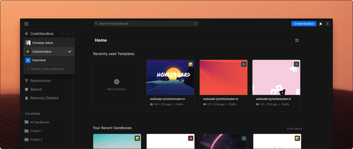
Teams are where individuals and teams of people can create and organize sandboxes. They enable you to keep your personal and work projects separate, as well as manage sandboxes more effectively. Everyone gets a private dashboard, where you can experiment, work on side-projects, and keep whichever sandboxes you want to yourself. But now you can create team dashboards too. You might create one or more to work with a team, or on various projects. Then invite your friends and colleagues to join you, so you can all work on a set of shared sandboxes, sorted into folders. This is the best way to collaborate together on sandboxes.
You can create a new team here! In the future, you'll be able to set team-level settings and secrets too.
A new-look dashboard
But team dashboards aren't the only new thing. While staying close to what people are familiar with, we've refreshed the look and feel of the dashboard. This update evolves the design to bring through the updates made in the editor and makes working with large numbers of sandboxes a much better experience too.
A new start screen
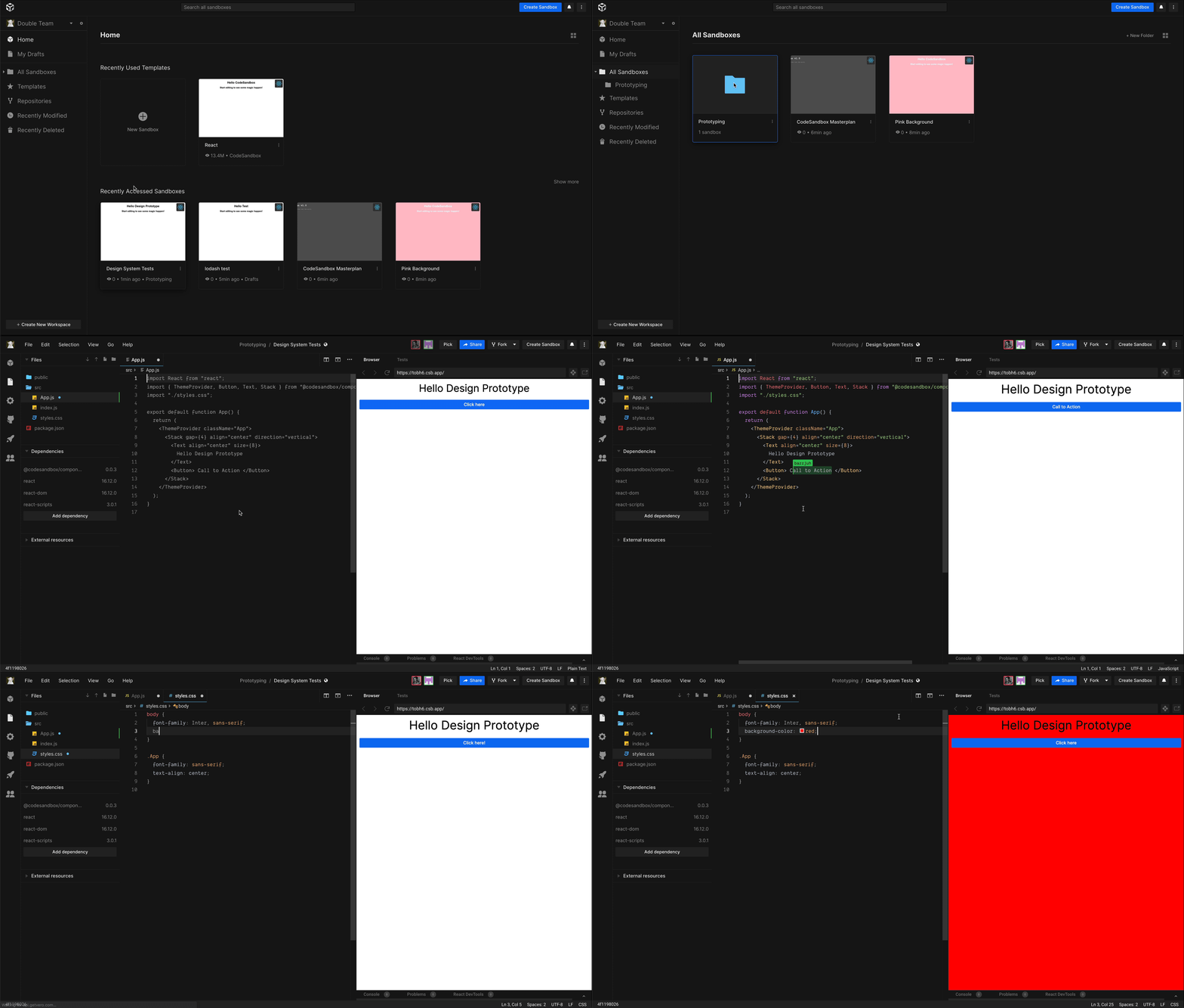
You now start from the home screen. The home screen lists only the last few templates and sandboxes you've used—the stuff you're most likely to want to dive back in to. We've also added a 'recently modified' section, which shows the sandboxes edited today, in the last seven days, as well as within the last month. So you no longer need to trawl through a big list of sandboxes to pick out a new sandbox you want to carry on with.
My Drafts
With that said, you don't need to go back to most of the sandboxes you create. That's part of the value of CodeSandbox, but this wasn't catered to by the old dashboard design. So we've added a new section called 'My Drafts' that collects together all the sandboxes you don't categorize yourself. Such projects would clutter the old dashboard and make the projects you did want to go back to harder to find. By default, new sandboxes now go into drafts.
Other dashboard improvements

There are other UX improvements too. There's now a list view, perfect for those with a large number of sandboxes. The dashboard is keyboard accessible, so you can move around and open sandboxes using only keys. The design is responsive, so you can get to your sandboxes quicker when you're on mobile, and we've tweaked drag-and-drop to make it easier to move groups of sandboxes between folders.
Notifications
We've also updated the design of notifications. You're forgiven if you didn't know we have notifications—they've only been used for team invitations in the dashboard to date. Now they're shown in the editor as well and let you know about new sandbox invitations too. Notifications will become increasingly useful as we deliver on more of our planned collaboration features, which is why we've also added new filter and dismiss options.
Join the Team Pro waiting list
For individuals, these updates make the dashboard a more productive starting point to jump back into projects and stay organized when you have large numbers of sandboxes.
For teams, it's a big step forward in being able to collaborate and work together. Sign up for the Team Pro waiting list to be one of the first to try other upcoming team features that will forever change how you work with others to create things with code.
Thanks
Thanks go to Siddharth Kshetrapal, Sara Viera, and Danny Ruchtie who worked hard to deliver this great update.


