Announcing CodeSandbox CI and all-new Embeds
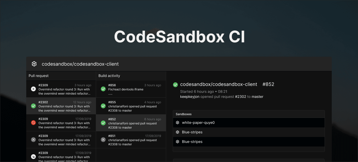
Today we're pleased to launch CodeSandbox CI - A free continuous integration service purpose-built for open source library maintainers, along with a new look for embeds.

CodeSandbox CI
Maintaining open source projects, while enormously fulfilling, can be time-consuming and stressful. After a busy #Hacktoberfest, we know from first-hand experience what it's like, and we wanted to help library maintainers make the best use of their time. Today we're pleased to launch CodeSandbox CI: A free continuous integration service purpose-built for open source library maintainers.
Here's how it works
CodeSandbox CI is a GitHub app that auto-builds your library from pull requests. Whenever someone opens a new pull request, CodeSandbox CI builds a new version of your library. Those builds get posted to our registry, so you can test it in CodeSandbox or locally, and all without having to publish the build to npm. Plus, if the original GitHub issue contains a link to a reproducible sandbox, then we'll automatically fork it using the new PR build. That means you can review it online with one click.
Used by the biggest names in OSS
After a successful private beta, CodeSandbox CI is already in use by projects like React, Babel, Framer, Material UI, and others. And it's proving to be a real time-saver.
Try it out for yourself by installing the GitHub app.
A new look for Embeds
CodeSandbox CI is the latest way maintainers can use CodeSandbox to save time and improve experiences for users and contributors. But more than 4000 open source projects already use CodeSandbox embeds in their docs, blog posts, and websites—providing visitors with working examples that help explain how to use their creations.
Embeds provide the ability to view a sandbox inline in your content, whether you want to show the code, the running app, or both at the same time. Our embeds use a specially designed version of CodeSandbox that's small in size but almost as powerful as the full thing, making for a great way to explain a coding concept or show off a demo.
We want you to be able to use embeds anywhere you want. So based on feedback from our community, we've launched a new default look and feel for embeds that's minimal in design and looks great wherever you place it. With a subtle color palette and no branding, it doesn't take the focus away from your great content.
Danny Ruchtie, Head of Design here at CodeSandbox, notes that with this release, “we've focused on building something that would better blend in with its surroundings while maintaining all its powerful features. So there's less focus on the UI and more on the content. We also wanted to give users more control and improve the embed experience on mobile.”
See the difference for yourself:
The next big design trend?
Ahead of the hipster crowd and the recent dark mode trend (we've had a default dark theme since we started!), we're pleased to introduce what's sure to be the next big thing in web design: light mode!
Seriously though, while black's our go-to, we appreciate it doesn't always work for some site designs. So we've added a new white-based theme for embeds, which you can toggle on when creating an embed from the Share menu in the editor.
The new design is already live, so check it out and take a look at our docs for more info.
Get more done
With embeds, and now CodeSandbox CI, we're giving open-source project maintainers new ways to reduce their support overhead and get more done. Available now, CodeSandbox CI makes it possible to test fixes without the need to clone, install, and check things locally. There’s more info about how to configure CodeSandbox CI in our docs, and you can get started by installing the GitHub app.
Thanks
Thanks goes to Bogdan Luca, Siddharth Kshetrapal, and Danny Ruchtie whose hard work made these updates possible. And also to our community for your thoughtful feedback and suggestions. We can't wait to see what you will build!


